advanced search
Clients can browse and search jobs by area, industry, or keywords with our easy to use search functions.
We design & build powerful recruitment websites that simply do the job. Our websites make connections, increase conversions and essentially pay for themselves.

built-in job board search & application functions

Clients can browse and search jobs by area, industry, or keywords with our easy to use search functions.

Your visitors can apply for jobs directly and upload their resumes using our resume submission forms.

Candidates can post their search criteria then your website will let them know as and when you post suitable jobs.
Clients can browse and search jobs by area, industry, or keywords with our easy to use search functions.
Your visitors can apply for jobs directly and upload their resumes using our resume submission forms.
Candidates can post their search criteria then your website will let them know as and when you post suitable jobs.
bespoke design, unique, responsive websites
We build all of our websites from scratch to give uniqueness with each and every project. Our design team works very closely with you to make sure you get the best results and to help set your company apart from your competitors.
Not only do our websites stand out from the rest but they also work awesomely on all devices. Our websites are built with a responsive design so whether it be a mobile, a tablet or a desktop that your visitors are using then you can be sure it will just look great regardless.

websites built for simplicity
Our websites are built with simplicity in mind and designed to be user friendly for both you and your website visitors. Each website has a built-in content editor that's just a pleasure to use. Easily add or edit text and imagery, update your blog, and most importantly post jobs.
On the top of all this our websites are built in a way that makes them easily maintainable and up-gradable. A future proof website that's ready to accommodate any plans you may have in the near or distant future.
we build websites that convert

Catch candidates resumes with a resume lead magnet function. Resumes will be captured and sent to you instantaneously.

Capture client job vacancies with a job vacancy registration form. Make it easy for your clients to tell you about new vacancies straight from your website.

Make it easy for clients and candidates to find and learn more about you by adding interactive Google maps & social media handles.
Catch candidates resumes with a resume lead magnet function. Resumes will be captured and sent to you instantaneously.
Capture client job vacancies with a job vacancy registration form. Make it easy for your clients to tell you about new vacancies straight from your website.
Make it easy for clients and candidates to find and learn more about you by adding interactive Google maps & social media handles.
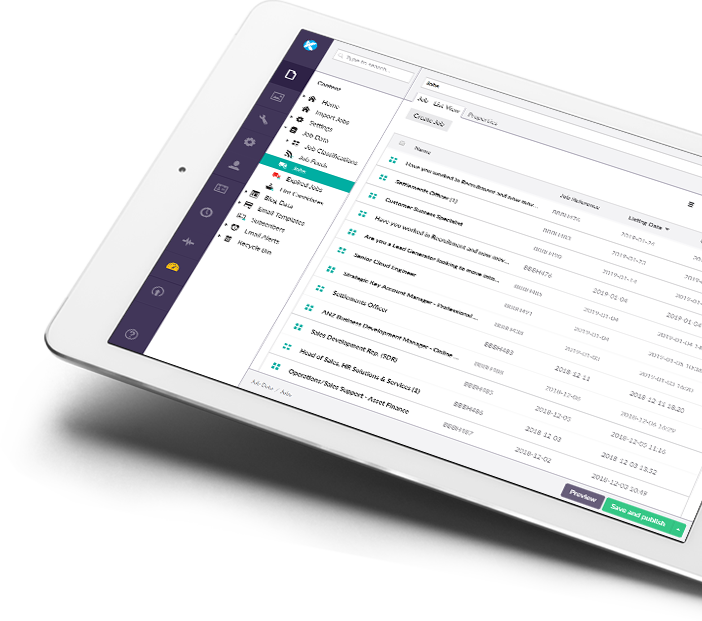
integrating with your ATS/CRM
Our websites can seamlessly integrate with your ATS, CRM or your multi-job poster. This means that our websites can automatically receive job listings posted from within your recruitment software and at the same time can give you the ability track applications in your ATS the second they are captured on your website.
Our websites have a smooth user experience, a simple and fast website admin experience and a perfectly engineered workflow designed to boost productivity.
transparent pricing.
Two easy to follow pricing models for our bespoke website packages(Standard up front payment or SaaS model). No hidden fees!
We offer a high level of support and will NOT charge for content edits. If you need any large changes like additional pages /extra functionality / design work / additional or change of integration, we will always make you aware of any costs before hand and keep them too a minimum.

Own your own website with a one-off cost. A great package for clients who have original ideas and want more flexibility and control over their website and it's features. If you don't like long contracts this is the package for you.
Tell Me MoreGet up and running faster and save money on initial up-front costs. Our SaaS recsite as a service package bundles website build costs, hosting, and ongoing support into one simple monthly payment.
Tell Me More